 Ana Sayfa
  Hakkımızda
  Kadro
Kadro  Anime
Anime  Manga
Manga  Ekstra
  Sözlük
  K.S.S
K.S.S  İndirme
 Template Features
Top Features
1Transparent Design with Color Chooser: A combination of a transparent design and the Gantry-based Color Chooser constitute the stylistic core of the template, allowing for absolute and versatile stylistic control and diversity.
2Gantry Framework: A powerful core framework, offering features such as per-menu item parameters, an iPhone version and so much more, which substantially extends the features and functions of the Joomla core.
33rd Party Compatibility Styling: Compatibility styling constitutes basic CSS alterations to better integrate the extensions with the template, rather than full theme integration. Example extensions: K2, Tienda and JomSocial.
Core Template Features
- Transparent Design
- Color Chooser
- 12 Preset Styles
- Fusion with MegaMenu
- Splitmenu
- Custom Typography
- 68 Module Positions
- 24 Module Variations - 72 Combo Possibilities
- RocketTheme Extensions Styling
- 3rd Party Extensions Compatibility Styling
- Javascript Input Styling (Checkboxes etc...)
- FF 3.6, Safari 4, Opera 10.x, IE8 Compatible
- Limited IE6 Browser Compatibility
- Template RTL Support
- W3C XHTML 1.0 / CSS 3 Valid
Gantry Framework Features
- 960 Grid System - 6 Grids per Row
- Image Smart Loading
- Ajax Article Loading
- IE6 Warning Message
- Source Ordered Mainbody
- 38 Layout Combinations for Mainbody
- Extensive Administrator Interface
- Per-menu-item Configuration / Parameters
- Per Browser based CSS / JS control
- Built-in GZip and General Caching
- iPhone Version - Mobile Theme
- Google Web Fonts Support
- Grid RTL Support
- Tableless Overrides
- Optimized Code Base
RocketTheme Extensions
This demo includes a series of RocketTheme Extensions, some of which have template specific styling.
Included ExtensionsTutorial Information
This demo has a range of tutorials and guides to introduce you to the core features and basics of the template.
Available GuidesGantry Framework
gan·try (gan′trē) noun
- (RocketTheme) A framework used for assembling, building and maintaining a RocketTheme template
Extensive Gantry Documentation
Key Features
Gantry has a plethora of features, below is just a brief list:
- 960 Grid System
- Stunning Administrator interface
- XML driven and with overrides for unprecedented levels of customization
- Per-menu-item level control over any configuration parameter
- Preset any combination of configuration parameters, and save custom presets
- 65 base module positions. Easily add more!
- 36 possible layout combinations for mainbody and sidebars
- Up to 3 sidebars for a total of 4 column layouts
- Many built-in features such as font-sizer, to-top smooth slider, IE6 warning message, etc.
- Flexible grid layout system for unparalleled control over block sizes
- iPhone Native Version, a mobile specific version / theme
- Google Web Fonts, load custom fonts from Googles's Font Directory
- Smart Loading, only load the images that are in focus for optimized loading
Installing / Updating Gantry
For Zephyr, you should install the Zephyr Template (Bundle) package, rt_zephyr_j15-bundle.tar.gz, which includes both the template and Gantry. Use the standalone package if Gantry is already installed. However, in the event of Gantry needing to be installed, see the instructions below:
Overview of the Administrator Interface
The Gantry administrator is a very extensive interface for controlling allow aspects of the Framework, and is split into several parts:
- Per-Menu Item Configuration
- Presets
- Settings
- Features
- Layouts
- Advanced
Gantry Administrator Documentation
Yorum ekleModule Variations
Module Variations allow you to individually style a module Enter any available suffixes at Extensions → Module Manager → Module → Module Class Suffix
There are 24 suffixes: title1-6, box1-12; flush, flushtop, flushbottom; plus standardcase, uppercasefa and lowercase.
- Title: 6 suffixes that vary the appearance of the module title.
- Standard/Upper/Lower Case: change the case style of the module title.
- Box: 12 variations to change the background of the module.
- Flush/FlusTop/FlushBottom: removes the margin/padding around the module surround.
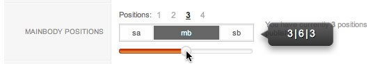
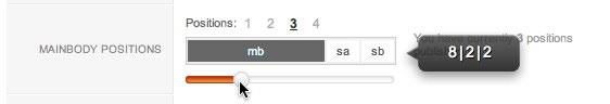
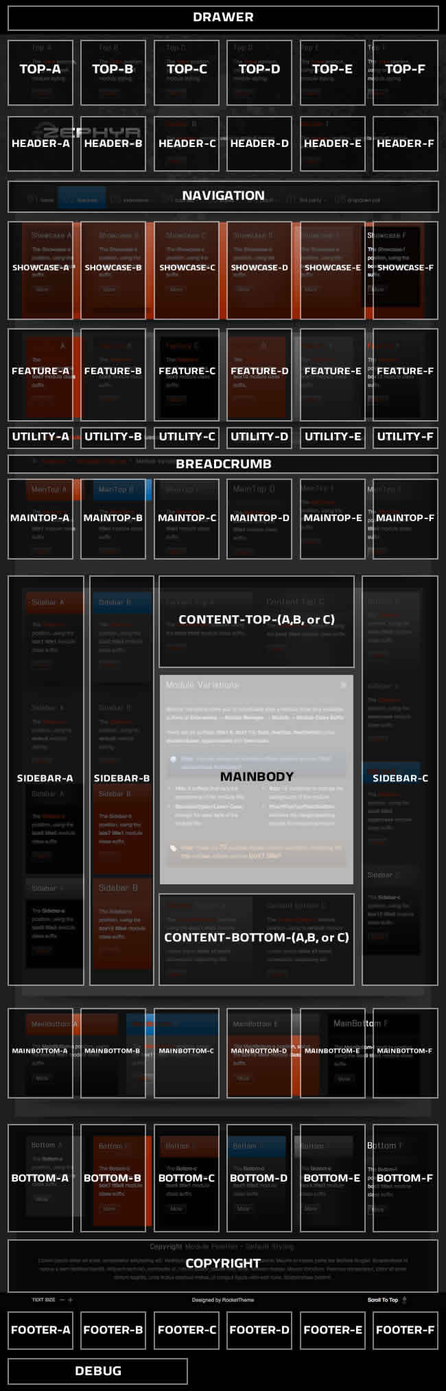
Module Positions
There are 68 module positions. If no module is published to a position, it will not appear, collapsing the entire area.
Non-Standard Elements
There are non-standard elements that are injected into the template grid structure when enabled via the template parameter, such as the logo into header-a. These features stack vertically with any modules published to that position.
Layout Control
Control all modules positions with Gantry, in terms of widths within the module row, and left/right/middle placement for the mainbody/sidebar area.
Gantry Framework : Layouts Documentation
Preview
The below diagram is of the Module Variations page.
 Yorum ekle
HTML Typography
Praesent rutrum sapien ac felis. Phasellus elementum dolor quis turpis. Vestibulum nec mi vitae pede.
Proin ac nunc eu nunc condimentum accumsan. Phasellus odio justo, euismod vitae, egestas a.
This is a H1 Header
Lorem ipsum dolor sit amet, consectetuer adipiscing elit. Proin sit amet odio quis sapien molestie ultrices.
This is a H2 Header
Proin ac nunc eu nunc condimentum accumsan. Phasellus odio justo, euismod vitae, egestas a, porttitor
This is a H3 Header
Mauris euismod. In ac massa vitae quam tincidunt dapibus. Ut at tortor nec mi mattis blandit.
This is a H4 Header
Vestibulum posuere, lacus aliquet pulvinar faucibus, tortor urna luctus diam, vitae ultrices ante.
This is a H5 Header
Pellentesque vel enim urna, sit amet blandit ipsum. Maecenas quis sem sit amet nunc pretium mattis. Sed dapibus semper est, sed pretium erat sodales sed. Aenean hendrerit fringilla sem, et tincidunt libero ornare at.
Blockquote Example
This is a blockquote, you will want to use the following formatting: <blockquote><p>....</p></blockquote>. Praesent rutrum sapien ac felis. Phasellus elementum dolor quis turpis. Vestibulum nec mi vitae pede tincidunt nonummy.
DropCap Styles
PPraesent rutrum sapien ac felis. Phasellus elementum dolor quis turpis. Vestibulum nec mi vitae pede tincidunt nonummy. Vestibulum facilisis mollis neque. Sed orci. Cum sociis natoque penatibus et magnis dis.
You will need to use the following formatting: <p class="dropcap"><span class="dropcap">P</span></p>
Number Examples
1
You will need to use the following formatting: <p class="dropcap"><span class="dropcap">1</span></p>.
Praesent rutrum sapien ac felis. Phasellus elementum dolor quis turpis. Vestibulum nec mi vitae pede tincidunt nonummy. Vestibulum facilisis mollis neque. Sed orci. Cum sociis natoque penatibus et magnis dis parturient.
2
You will need to use the following formatting: <p class="dropcap"><span class="dropcap">2</span></p>.
Praesent rutrum sapien ac felis. Phasellus elementum dolor quis turpis. Vestibulum nec mi vitae pede tincidunt nonummy. Vestibulum facilisis mollis neque. Sed orci. Cum sociis natoque penatibus et magnis dis parturient.
3
You will need to use the following formatting: <p class="dropcap"><span class="dropcap">3</span></p>.
Praesent rutrum sapien ac felis. Phasellus elementum dolor quis turpis. Vestibulum nec mi vitae pede tincidunt nonummy. Vestibulum facilisis mollis neque. Sed orci. Cum sociis natoque penatibus et magnis dis parturient.
List Styles - Icon Bullets
Below is a list with icons. To use this style create a list in the following format: <ul class="class name"><li>....</li><li>....</li>...</ul>
- To use this style create a list in the following format: <ul class="bullet-1dd"><li>....</li><li>....</li>...</ul>.
- To use this style create a list in the following format: <ul class="bullet-1dd"><li>....</li><li>....</li>...</ul>.
- To use this style create a list in the following format: <ul class="bullet-arrow"><li>....</li><li>....</li>...</ul>.
- To use this style create a list in the following format: <ul class="bullet-arrow"><li>....</li><li>....</li>...</ul>.
- To use this style create a list in the following format: <ul class="bullet-arrow2"><li>....</li><li>....</li>...</ul>.
- To use this style create a list in the following format: <ul class="bullet-arrow2"><li>....</li><li>....</li>...</ul>.
- To use this style create a list in the following format: <ul class="bullet-briefcase"><li>....</li><li>....</li>...</ul>.
- To use this style create a list in the following format: <ul class="bullet-briefcase"><li>....</li><li>....</li>...</ul>.
- To use this style create a list in the following format: <ul class="bullet-calendar"><li>....</li><li>....</li>...</ul>.
- To use this style create a list in the following format: <ul class="bullet-calendar"><li>....</li><li>....</li>...</ul>.
- To use this style create a list in the following format: <ul class="bullet-check"><li>....</li><li>....</li>...</ul>.
- To use this style create a list in the following format: <ul class="bullet-check"><li>....</li><li>....</li>...</ul>.
- To use this style create a list in the following format: <ul class="bullet-crank"><li>....</li><li>....</li>...</ul>.
- To use this style create a list in the following format: <ul class="bullet-crank"><li>....</li><li>....</li>...</ul>.
- To use this style create a list in the following format: <ul class="bullet-delete"><li>....</li><li>....</li>...</ul>.
- To use this style create a list in the following format: <ul class="bullet-delete"><li>....</li><li>....</li>...</ul>.
- To use this style create a list in the following format: <ul class="bullet-docs"><li>....</li><li>....</li>...</ul>.
- To use this style create a list in the following format: <ul class="bullet-docs"><li>....</li><li>....</li>...</ul>.
- To use this style create a list in the following format: <ul class="bullet-email"><li>....</li><li>....</li>...</ul>.
- To use this style create a list in the following format: <ul class="bullet-email"><li>....</li><li>....</li>...</ul>.
- To use this style create a list in the following format: <ul class="bullet-home"><li>....</li><li>....</li>...</ul>.
- To use this style create a list in the following format: <ul class="bullet-home"><li>....</li><li>....</li>...</ul>.
- To use this style create a list in the following format: <ul class="bullet-key"><li>....</li><li>....</li>...</ul>.
- To use this style create a list in the following format: <ul class="bullet-key"><li>....</li><li>....</li>...</ul>.
- To use this style create a list in the following format: <ul class="bullet-lock"><li>....</li><li>....</li>...</ul>.
- To use this style create a list in the following format: <ul class="bullet-lock"><li>....</li><li>....</li>...</ul>.
- To use this style create a list in the following format: <ul class="bullet-minus"><li>....</li><li>....</li>...</ul>.
- To use this style create a list in the following format: <ul class="bullet-minus"><li>....</li><li>....</li>...</ul>.
- To use this style create a list in the following format: <ul class="bullet-monitor"><li>....</li><li>....</li>...</ul>.
- To use this style create a list in the following format: <ul class="bullet-monitor"><li>....</li><li>....</li>...</ul>.
- To use this style create a list in the following format: <ul class="bullet-notes"><li>....</li><li>....</li>...</ul>.
- To use this style create a list in the following format: <ul class="bullet-notes"><li>....</li><li>....</li>...</ul>.
- To use this style create a list in the following format: <ul class="bullet-post"><li>....</li><li>....</li>...</ul>.
- To use this style create a list in the following format: <ul class="bullet-post"><li>....</li><li>....</li>...</ul>.
- To use this style create a list in the following format: <ul class="bullet-printer"><li>....</li><li>....</li>...</ul>.
- To use this style create a list in the following format: <ul class="bullet-printer"><li>....</li><li>....</li>...</ul>.
- To use this style create a list in the following format: <ul class="bullet-rss"><li>....</li><li>....</li>...</ul>.
- To use this style create a list in the following format: <ul class="bullet-rss"><li>....</li><li>....</li>...</ul>.
- To use this style create a list in the following format: <ul class="bullet-star"><li>....</li><li>....</li>...</ul>.
- To use this style create a list in the following format: <ul class="bullet-star"><li>....</li><li>....</li>...</ul>.
- To use this style create a list in the following format: <ul class="bullet-star2"><li>....</li><li>....</li>...</ul>.
- To use this style create a list in the following format: <ul class="bullet-star2"><li>....</li><li>....</li>...</ul>.
- To use this style create a list in the following format: <ul class="bullet-unlock"><li>....</li><li>....</li>...</ul>.
- To use this style create a list in the following format: <ul class="bullet-unlock"><li>....</li><li>....</li>...</ul>.
- To use this style create a list in the following format: <ul class="bullet-warning"><li>....</li><li>....</li>...</ul>.
- To use this style create a list in the following format: <ul class="bullet-warning"><li>....</li><li>....</li>...</ul>.
- To use this style create a list in the following format: <ul class="bullet-write"><li>....</li><li>....</li>...</ul>.
- To use this style create a list in the following format: <ul class="bullet-write"><li>....</li><li>....</li>...</ul>.
List Styles - Numbers
Below is a list with numbers. To use this style create a list in the following format: <ul class="class name"><li>....</li><li>....</li>...</ul>
- To use this style create a list in the following format: <ul class="bullet-no1"><li>....</li><li>....</li>...</ul>.
- To use this style create a list in the following format: <ul class="bullet-no2"><li>....</li><li>....</li>...</ul>.
- To use this style create a list in the following format: <ul class="bullet-no3"><li>....</li><li>....</li>...</ul>.
- To use this style create a list in the following format: <ul class="bullet-no4"><li>....</li><li>....</li>...</ul>.
- To use this style create a list in the following format: <ul class="bullet-no5"><li>....</li><li>....</li>...</ul>.
- To use this style create a list in the following format: <ul class="bullet-no6"><li>....</li><li>....</li>...</ul>.
- To use this style create a list in the following format: <ul class="bullet-no7"><li>....</li><li>....</li>...</ul>.
- To use this style create a list in the following format: <ul class="bullet-no8"><li>....</li><li>....</li>...</ul>.
- To use this style create a list in the following format: <ul class="bullet-no9"><li>....</li><li>....</li>...</ul>.
- To use this style create a list in the following format: <ul class="bullet-no10"><li>....</li><li>....</li>...</ul>.
List Styles - Bullets
Below is a list with bullets. To use this style create a list in the following format: <ul class="class name"><li>....</li><li>....</li>...</ul>
- To use this style create a list in the following format: <ul class="bullet-1"><li>....</li><li>....</li>...</ul>.
- To use this style create a list in the following format: <ul class="bullet-1"><li>....</li><li>....</li>...</ul>.
- To use this style create a list in the following format: <ul class="bullet-2"><li>....</li><li>....</li>...</ul>.
- To use this style create a list in the following format: <ul class="bullet-2"><li>....</li><li>....</li>...</ul>.
- To use this style create a list in the following format: <ul class="bullet-3"><li>....</li><li>....</li>...</ul>.
- To use this style create a list in the following format: <ul class="bullet-3"><li>....</li><li>....</li>...</ul>.
- To use this style create a list in the following format: <ul class="bullet-4"><li>....</li><li>....</li>...</ul>.
- To use this style create a list in the following format: <ul class="bullet-4"><li>....</li><li>....</li>...</ul>.
- To use this style create a list in the following format: <ul class="bullet-5"><li>....</li><li>....</li>...</ul>.
- To use this style create a list in the following format: <ul class="bullet-5"><li>....</li><li>....</li>...</ul>.
- To use this style create a list in the following format: <ul class="bullet-6"><li>....</li><li>....</li>...</ul>.
- To use this style create a list in the following format: <ul class="bullet-6"><li>....</li><li>....</li>...</ul>.
- To use this style create a list in the following format: <ul class="bullet-7"><li>....</li><li>....</li>...</ul>.
- To use this style create a list in the following format: <ul class="bullet-7"><li>....</li><li>....</li>...</ul>.
- To use this style create a list in the following format: <ul class="bullet-8"><li>....</li><li>....</li>...</ul>.
- To use this style create a list in the following format: <ul class="bullet-8"><li>....</li><li>....</li>...</ul>.
- To use this style create a list in the following format: <ul class="bullet-9"><li>....</li><li>....</li>...</ul>.
- To use this style create a list in the following format: <ul class="bullet-9"><li>....</li><li>....</li>...</ul>.
- To use this style create a list in the following format: <ul class="bullet-10"><li>....</li><li>....</li>...</ul>.
- To use this style create a list in the following format: <ul class="bullet-10"><li>....</li><li>....</li>...</ul>.
Emphasis Styles
This is a emphasis tag that allows you to highlight words or phrases. Use the following format: <em class="italic">...</em>This is a emphasis tag that allows you to highlight words or phrases. Use the following format: <em class="bold">...</em>
This is a emphasis tag that allows you to highlight words or phrases. Use the following format: <em class="bold2">...</em>
Inset Styles
Praesent rutrum sapien ac felis. Phasellus elementum dolor quis turpis. Vestibulum nec mi vitae pede tincidunt nonummy. Vestibulum facilisis mollis neque. Sed orci. Cum sociis natoque penatibus et magnis dis parturient montes, nascetur ridiculus mus. Inset Right TitleYou will need to use the following formatting: <span class="inset-right"> <span class="inset-right-title"> .... </span> ... some content ... </strong> Vestibulum facilisis mollis neque. Sed orci. Cum sociis natoque penatibus et magnis dis parturient montes, nascetur ridiculus mus. Sed euismod magna a nibh.
Praesent rutrum sapien ac felis. Phasellus elementum dolor quis turpis. Vestibulum nec mi vitae pede tincidunt nonummy. Vestibulum facilisis mollis neque. Sed orci. Cum sociis natoque penatibus et magnis dis parturient montes, nascetur ridiculus mus. Inset Left TitleYou will need to use the following formatting: <span class="inset-left"> <span class="inset-left-title"> .... </span> ... some content ... </strong> Vestibulum facilisis mollis neque. Sed orci. Cum sociis natoque penatibus et magnis dis parturient montes, nascetur ridiculus mus. Sed euismod magna a nibh.
Sed euismod magna a nibh. Praesent rutrum sapien ac felis. Phasellus elementum dolor quis turpis. Vestibulum nec mi vitae pede tincidunt nonummy. Praesent rutrum sapien ac felis. Phasellus elementum dolor quis turpis. Vestibulum nec mi vitae pede tincidunt nonummy. Vestibulum facilisis mollis neque. Sed orci. Cum sociis natoque penatibus et magnis dis parturient montes, nascetur ridiculus mus.Praesent rutrum sapien ac felis. Phasellus elementum dolor quis turpis. Vestibulum nec mi vitae pede tincidunt nonummy. Vestibulum facilisis mollis neque. Sed orci. Cum sociis natoque penatibus et magnis dis parturient montes, nascetur ridiculus mus.
Notice Styles
Pre Example
This is a sample <pre>...</pre> tag:

div.modulebox-black div.bx1 {
  background: url(../images/black/box_bl.png) 0 100% no-repeat;
}

div.modulebox-black div.bx2 {
  background: url(../images/black/box_tr.png) 100% 0 no-repeat;
}

div.modulebox-black div.bx3 {
  background: url(../images/black/box_tl.png) 0 0 no-repeat;
  padding: 0;
  margin: 0;
}
Yorum ekle
