 Ana Sayfa
  Hakkımızda
  Kadro
Kadro  Anime
Anime  Manga
Manga  Ekstra
  Sözlük
  K.S.S
K.S.S  İndirme
 Child Item
- Gösterim: 1372
Lorem ipsum dolor sit amet, consectetur adipiscing elit. Donec sit amet nibh. Vivamus non arcu. Lorem ipsum dolor sit amet, consectetur adipiscing elit. Etiam dapibus, tellus ac ornare aliquam, massa diam tristique urna, id faucibus lectus erat ut pede. Maecenas varius neque nec libero laoreet faucibus. Phasellus sodales, lectus sed vulputate rutrum, ipsum nulla lacinia magna, sed imperdiet ligula nisi eu ipsum. Donec nunc magna, posuere eget, aliquam in, vulputate in, lacus. Sed venenatis. Donec nec dolor vitae mauris dapibus ullamcorper. Etiam iaculis mollis tortor.
In erat. Pellentesque erat. Mauris vehicula vestibulum justo. Cum sociis natoque penatibus et magnis dis parturient montes, nascetur ridiculus mus. Nulla pulvinar est. Integer urna. Pellentesque pulvinar dui a magna. Nulla facilisi. Proin imperdiet. Aliquam ornare, metus vitae gravida dignissim, nisi nisl ultricies felis, ac tristique enim pede eget elit. Integer non erat nec turpis sollicitudin malesuada. Vestibulum dapibus. Nulla facilisi. Nulla iaculis, leo sit amet mollis luctus, sapien eros consectetur dolor, eu faucibus elit nibh eu nibh. Maecenas lacus pede, lobortis non, rhoncus id, tristique a, mi. Cras auctor libero vitae sem vestibulum euismod. Nunc fermentum.
Mauris lobortis. Aliquam lacinia purus. Pellentesque magna. Mauris euismod metus nec tortor. Phasellus elementum, quam a euismod imperdiet, ligula felis faucibus enim, eu malesuada nunc felis sed turpis. Morbi convallis luctus tortor. Integer bibendum lacinia velit. Suspendisse mi lorem, porttitor ut, interdum et, lobortis a, lectus. Phasellus vitae est at massa luctus iaculis. In tincidunt.
Integer fermentum elit in tellus. Integer ligula ipsum, gravida aliquet, fringilla non, interdum eget, ipsum. Praesent id dolor non erat viverra volutpat. Fusce tellus libero, luctus adipiscing, tincidunt vel, egestas vitae, eros. Vestibulum mollis, est id rhoncus volutpat, dolor velit tincidunt neque, vitae pellentesque ante sem eu nisl. Donec facilisis, magna eget elementum pellentesque, augue arcu aliquet eros, eget convallis mauris ante quis magna. Pellentesque habitant morbi tristique senectus et netus et malesuada fames ac turpis egestas. Aenean et libero. Nam aliquam. Quisque vitae tortor id neque dignissim laoreet. Duis eu ante. Integer at sapien. Praesent sed nisl tempor est pulvinar tristique. Maecenas non lorem quis mi laoreet adipiscing. Sed ac arcu. Sed tincidunt libero eu dolor. Cras pharetra posuere eros. Donec ac eros id diam tempor faucibus. Fusce feugiat consequat nulla. Vestibulum tincidunt vulputate ipsum.
Nullam eget neque. Nullam imperdiet venenatis ligula. Integer a leo. Nunc consectetur. Maecenas sem. Proin vulputate, massa vel volutpat laoreet, purus erat pretium ligula, eget varius arcu nibh sed libero. Fusce ante. Nullam interdum aliquet metus. Ut ultrices vestibulum tellus. Praesent quis erat. Nam id turpis sit amet neque cursus luctus. Cum sociis natoque penatibus et magnis dis parturient montes, nascetur ridiculus mus. Quisque id tortor. In vitae sapien. Nunc quis tellus.
Yorum ekleColor Chooser
- Gösterim: 1218
Color Chooser is a Gantry-Admin based control interface which, through simple controls, allows you to change all color and style elements of the template, such as text and background color.
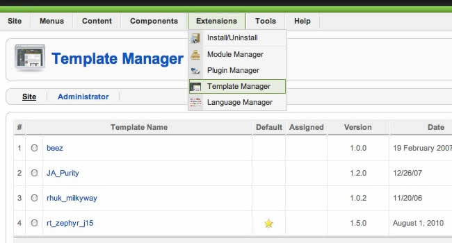
Access the Color Chooser
Access the Color Chooser from Admin → Extensions → Template Manager → rt_zephyr_j15 → Settings
Configuration
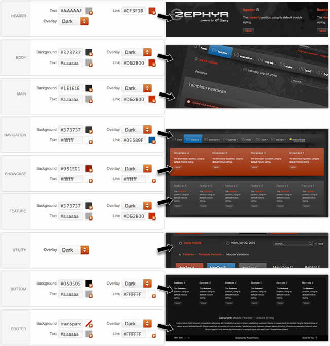
You can control 7 sections of the template, in 4 different aspects:
Color Chooser Sections
- Body - Background Area
- Main - Mainbody / Content Area
- Navigation - Menu Area
- Header; Showcase; Feature; Utility; Bottom; Footer - Module Position Rows
Section Controls
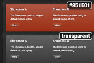
- Background Color
- Overlay Type - Light or Dark
- Text Color
- Link Color
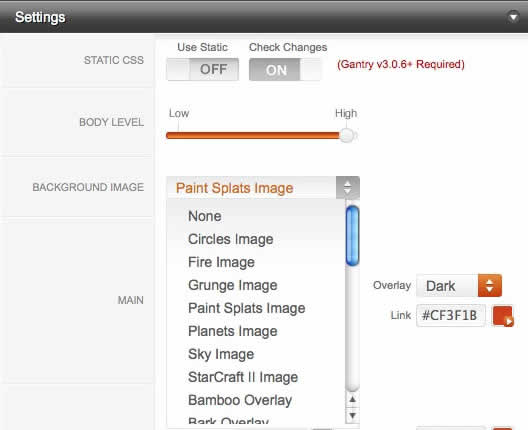
Configuration: Background Controls
- Static CSS: Places all inline CSS into CSS files for increased performance
- Body Level: High or Low to reduce the detailing of the template such as no overlays
- Background Image: Select an image to display in the page backgorund
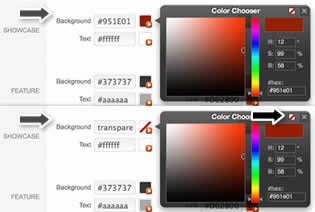
MooRainbow & Transparent Mode
Click on the color icons to trigger the MooRainbow popup. Pick any color or transparent.
Gantry Settings → General Style Controls
Theses settings are not directly affiliated with the Color Chooser portion, but affect the template styling nevertheless.
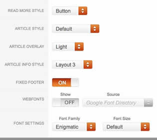
- Read More Style: Button or Link
- Article Style: Default, Title1-6
- Article Overlay: Light or Dark
- Article Info Style: Layout1-3
- Fixed Footer: On - Off
- Web Fonts: On - Off; Google Font Directory
- Font Settings:
- Font Family: Enigmatic, Geneva, Optima, Helvetica, Trebuchet, Lucida, Georgia, Palatino, or Various Google Fonts (dropdown)
- Font Size: Default, Extra Large, Large, Small, Extra Small (dropdown)
Fusion menu
- Gösterim: 976
Fusion Menu is a menu theme of the RokNavMenu extension, the addon that drives all RocketTheme template menus. It is primarily a javascript enhanced CSS dropdown menu, that combines standard suckerfish type functionality with animations, transitions and other advanced effects provided by Mootools.
New Features
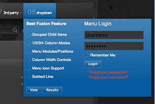
In Zephyr, Fusion Menu has been extended with the following features:
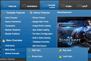
- Triple / Quad Column Mode
- Column Menu Grouping
- Column Width Control
- Load Modules inside Dropdowns
- Load Module Positions inside Dropdowns
Recurring Features
Below is a list of the standard, recurring features of the Fusion Menu:
- Single Column Mode
- Dual Column Mode
- Menu Item Subtext
- Menu Item Icons
- Javascript Controls
Editing Menu Items
All Menu Items can be edited from Admin → Menu → Menu Name → Menu Item.
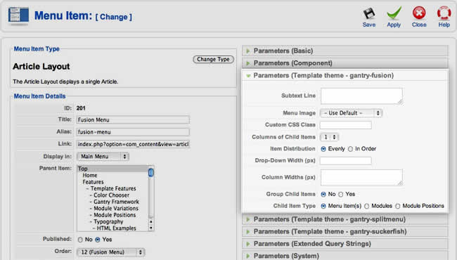
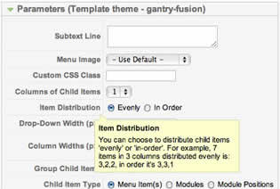
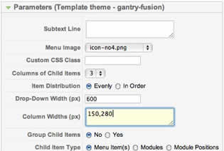
Basic Fusion Parameters
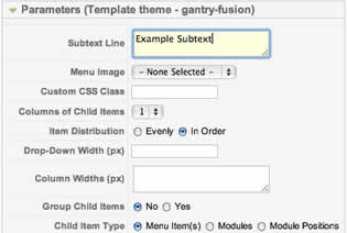
Adding Subtext
Subtext Line is the option that allows you to insert additional text to the Menu Item Title. There is separate styling for this, making it useful for adding brief descriptions to menu items.
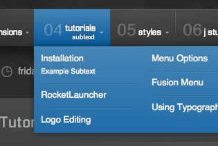
Adding Menu Icons
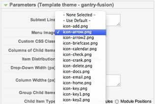
Menu Image is the option that allows you to insert an inline icon / image to the Menu Item.
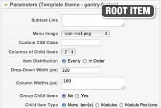
Advanced Fusion Parameters: Columns
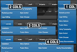
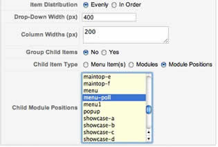
Menu Columns
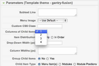
Columns of Child Items allows you to determine how many columns the Fusion dropdowns are presented in. You can have anywhere between a single dropdown to a four column dropdown.
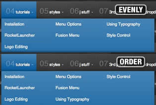
Item Distribution
Item Distribution allows you to control how the menu items are ordered in the dropdowns:
- Evenly: If there are 7 menu items in 3 columns, Fusion will allocate a 3,2,2 distribution - trying to equalize each dropdown.
- Order: If there are 7 menu items in 3 columns, Fusion will allocate a 3,3,1 distribution - maintaining the item ordering.
Drop-Down Width (px)
Drop-Down Width (px) determines the total width of the dropdown, regardless of how many columns are shown. This option is to be used in conjunction with Column Widths (px)
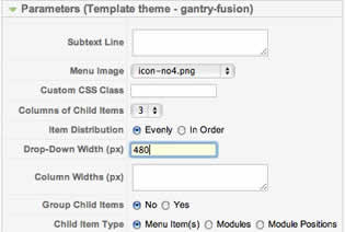
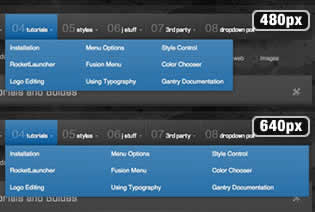
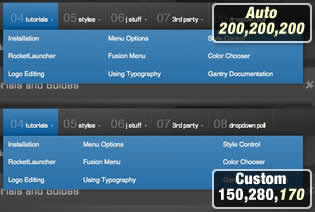
Column Widths (px)
Column Widths (px) determines the width of each Column. Separate each width by a comma. The final column's width is determined automatically. This option is to be used in conjunction with Drop-Down Width (px)
Below are some example configurations:
- Drop-Down Width: 480px: 160,160. Fusion automatically calculates the final width as 160, so in practise, 160,160,160 is the actual distribution.
- Drop-Down Width: 600px: 160,160. Fusion automatically calculates the final width as 280, so in practise, 160,160,280 is the actual distribution.
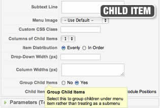
Advanced Fusion Parameters: Groupings
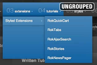
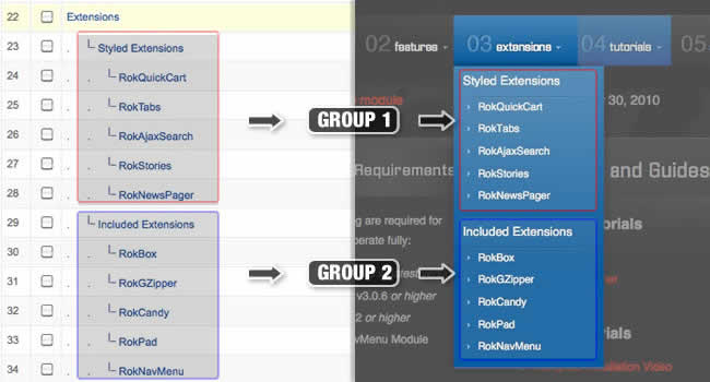
What is Grouping?
Group Child Items changes the behaviour of child items in the dropdown menus, instead of creating a dropdown for the immediate sublevel, this option places them inline. See below for an illustrated example of the differences:
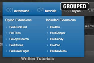
Configuration
Set Group Child Items to Yes to activate the mode. The sublevels well then appear below the parent menu item in a categorical type structure.
Below is a diagram of how the menu groupings in Joomla translate into the Fusion Menu:
Advanced Fusion Parameters: Modules
Fusion is now capable of loading individual modules or entire module positions inside its dropdowns.
Loading Individual Modules
Set Child Item Type to Modules to load all modules setup on your Joomla site in a list. Select the module you wish to display in the dropdown.
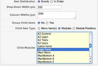
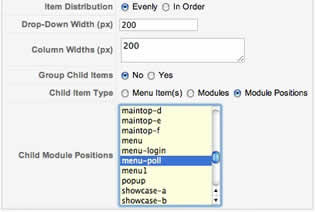
Loading Module Positions
Set Child Item Type to Modules Positions to load all module positions on your Joomla site in a list. Select the position you wish to display in the dropdown.
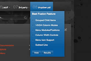
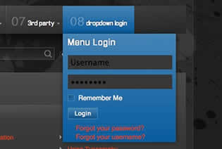
Below is an example of multiple modules appearing in a dropdown:
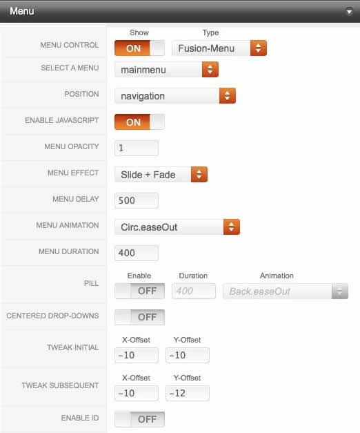
Template Configuration: Fusion Menu
Go to Extensions → Template Manager → rt_zephyr_j15 → Menu Set Menu Control to Type : Fusion-Menu, to load all the Fusion parameters.
FusionMenu
- Gösterim: 954
Fusion Menu is a menu theme of the RokNavMenu extension, the addon that drives all RocketTheme template menus. It is primarily a javascript enhanced CSS dropdown menu, that combines standard suckerfish type functionality with animations, transitions and other advanced effects provided by Mootools.
New Features
In Zephyr, Fusion Menu has been extended with the following features:
- Triple / Quad Column Mode
- Column Menu Grouping
- Column Width Control
- Load Modules inside Dropdowns
- Load Module Positions inside Dropdowns
Recurring Features
Below is a list of the standard, recurring features of the Fusion Menu:
- Single Column Mode
- Dual Column Mode
- Menu Item Subtext
- Menu Item Icons
- Javascript Controls
Editing Menu Items
All Menu Items can be edited from Admin → Menu → Menu Name → Menu Item.
Basic Fusion Parameters
Adding Subtext
Subtext Line is the option that allows you to insert additional text to the Menu Item Title. There is separate styling for this, making it useful for adding brief descriptions to menu items.
Adding Menu Icons
Menu Image is the option that allows you to insert an inline icon / image to the Menu Item.
Advanced Fusion Parameters: Columns
Menu Columns
Columns of Child Items allows you to determine how many columns the Fusion dropdowns are presented in. You can have anywhere between a single dropdown to a four column dropdown.
Item Distribution
Item Distribution allows you to control how the menu items are ordered in the dropdowns:
- Evenly: If there are 7 menu items in 3 columns, Fusion will allocate a 3,2,2 distribution - trying to equalize each dropdown.
- Order: If there are 7 menu items in 3 columns, Fusion will allocate a 3,3,1 distribution - maintaining the item ordering.
Drop-Down Width (px)
Drop-Down Width (px) determines the total width of the dropdown, regardless of how many columns are shown. This option is to be used in conjunction with Column Widths (px)
Column Widths (px)
Column Widths (px) determines the width of each Column. Separate each width by a comma. The final column's width is determined automatically. This option is to be used in conjunction with Drop-Down Width (px)
Below are some example configurations:
- Drop-Down Width: 480px: 160,160. Fusion automatically calculates the final width as 160, so in practise, 160,160,160 is the actual distribution.
- Drop-Down Width: 600px: 160,160. Fusion automatically calculates the final width as 280, so in practise, 160,160,280 is the actual distribution.
Advanced Fusion Parameters: Groupings
What is Grouping?
Group Child Items changes the behaviour of child items in the dropdown menus, instead of creating a dropdown for the immediate sublevel, this option places them inline. See below for an illustrated example of the differences:
Configuration
Set Group Child Items to Yes to activate the mode. The sublevels well then appear below the parent menu item in a categorical type structure.
Below is a diagram of how the menu groupings in Joomla translate into the Fusion Menu:
Advanced Fusion Parameters: Modules
Fusion is now capable of loading individual modules or entire module positions inside its dropdowns.
Loading Individual Modules
Set Child Item Type to Modules to load all modules setup on your Joomla site in a list. Select the module you wish to display in the dropdown.
Loading Module Positions
Set Child Item Type to Modules Positions to load all module positions on your Joomla site in a list. Select the position you wish to display in the dropdown.
Below is an example of multiple modules appearing in a dropdown:
Template Configuration: Fusion Menu
Go to Extensions → Template Manager → rt_zephyr_j15 → Menu Set Menu Control to Type : Fusion-Menu, to load all the Fusion parameters.
Gantry Framework
- Gösterim: 1242
gan·try (gan′trē) noun
- (RocketTheme) A framework used for assembling, building and maintaining a RocketTheme template
Extensive Gantry Documentation
Key Features
Gantry has a plethora of features, below is just a brief list:
- 960 Grid System
- Stunning Administrator interface
- XML driven and with overrides for unprecedented levels of customization
- Per-menu-item level control over any configuration parameter
- Preset any combination of configuration parameters, and save custom presets
- 65 base module positions. Easily add more!
- 36 possible layout combinations for mainbody and sidebars
- Up to 3 sidebars for a total of 4 column layouts
- Many built-in features such as font-sizer, to-top smooth slider, IE6 warning message, etc.
- Flexible grid layout system for unparalleled control over block sizes
- iPhone Native Version, a mobile specific version / theme
- Google Web Fonts, load custom fonts from Googles's Font Directory
- Smart Loading, only load the images that are in focus for optimized loading
Installing / Updating Gantry
For Zephyr, you should install the Zephyr Template (Bundle) package, rt_zephyr_j15-bundle.tar.gz, which includes both the template and Gantry. Use the standalone package if Gantry is already installed. However, in the event of Gantry needing to be installed, see the instructions below:
Overview of the Administrator Interface
The Gantry administrator is a very extensive interface for controlling allow aspects of the Framework, and is split into several parts:
- Per-Menu Item Configuration
- Presets
- Settings
- Features
- Layouts
- Advanced
Gantry Administrator Documentation
Yorum ekle